Did you know that when making a purchase, 93% of shoppers primarily focus on visual appearance? That’s right and the significance of color choices in your print designs does impact your audience. Knowing which colors complement each other well can enhance the professionalism and appeal of your printed marketing materials.
Complementary colors play a vital role in designing your printed materials. These colors are positioned directly opposite each other on the color wheel and incorporating complementary colors into your design creates a distinct, vibrant, and striking visual effect! Ensure that you select shades of these colors that harmonize with each other, and avoid using too many different combinations of complementary colors within the same print design to avoid clashes.
Here are three complementary colors!

Red and Green
- Works best as deep shades or pastel tones (if avoiding a Christmas-like theme).
- Red evokes feelings of urgency, increased appetite, and encourages action. Use this to draw attention to the most important parts of your designs (sale icons and call-to-actions).
- Green evokes feelings of health, nature, and growth. Best for drawing emphasis to those feelings in relation to products, services, or messaging (all-natural products may benefit from green in their designs).

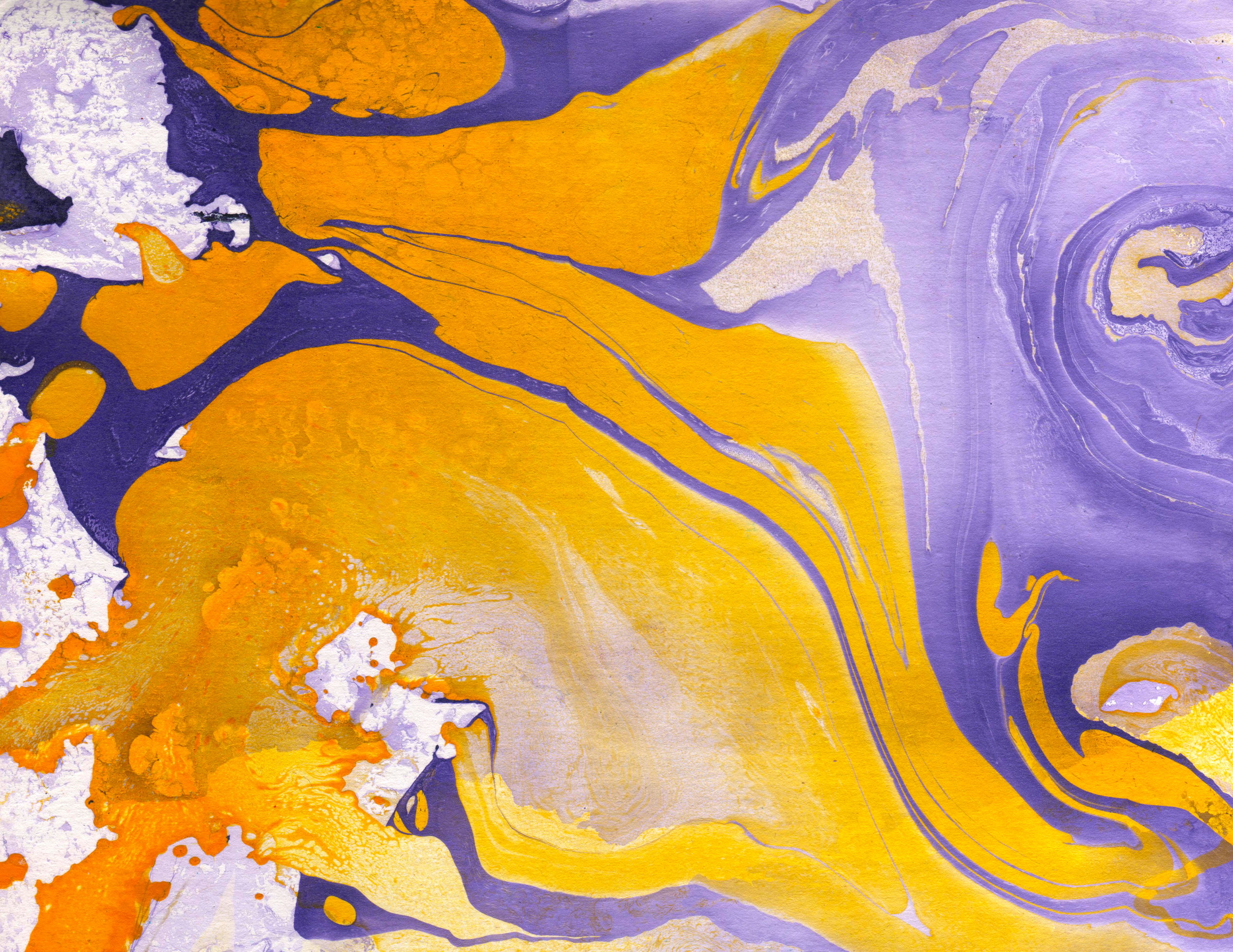
Yellow and Purple
- An excellent color combination that isn’t often used! This could help designs standout from the crowd.
- Yellow evokes feelings of positivity, happiness, and fun. This color is often popular on it’s own for inducing these emotions into print designs. Use this to highlight and pop aspects of your design, whether as a border or to color text.
- Purple evokes feelings of wealth (regal), mystery, wisdom, and otherworldliness. Purple is best to use as an accent color as its deep appearance can sometimes overtake the rest of the print design.

Blue and Orange
- A very popular choice that works well in nearly all shades and vibrancies.
- Blue evokes feelings of stability, trust, and calm. Use this to reinforce client confidence in your brand with design choices like blue certification logos, headings, and to highlight data in your print.
- Orange evokes feelings of creativity, enthusiasm, and accomplishment. It evokes warmth in a tone just below reds. Use orange to also highlight points that you want to bring attention to, such as call-to-action bubbles or sale prices.
—
By The Marketing Team at Broadstroke, Inc.
Call us @ 316.262.3333 or 855-778-9100 / Email us
—