We may live in a world that is more digital than ever, but print materials are standing the test of time. We’ve moved past the point where advances in technology make handing a client, customer or potential business partner printed materials feel dated. Instead, when you’ve put thought into the printed materials you’re giving someone, it shows that you value a potential relationship and want to take the extra step to stand out from your competition by providing a tangible leave behind.
One of the most common pieces of printed material is a business card. They can be easy to create, print and hand out, and there are plenty of opportunities to do so with trade shows, conferences, service and sales calls, and industry, organizational and community meetings, and presentations. Since they can be so easy for people to make and distribute, it’s also easy for them to get thrown away or forgotten about in a desk drawer. You can help make your card impactful and memorable for potential clients or customers through thoughtful design and paper choices.
There are many things you can do to help your card stand out. When you’re aware of the different choices available to tailor your card to you and your business, the options may seem endless. By considering the elements of a card in broad strokes, you can create a professional card while prioritizing certain elements to make it unique, without getting overwhelmed by process. The following are some of the elements or pieces you should consider the next time you’re ready to update or order business cards.
Paper. Business cards are traditionally printed on stock paper for more durability, but there are a wide variety of stock paper options available to choose from. You can increase the weight of the stock your card is printed on, opt for an alternative texture like suede or linen, or choose a gloss or high gloss finish instead of a more traditional matte finish. Or you could pick a colored stock paper and print it in a single color. If you’re interested in using a non-traditional stock for your card, Broadstroke can help. We can show you samples of different stock options so you can choose a look and feel that’s right for your business.
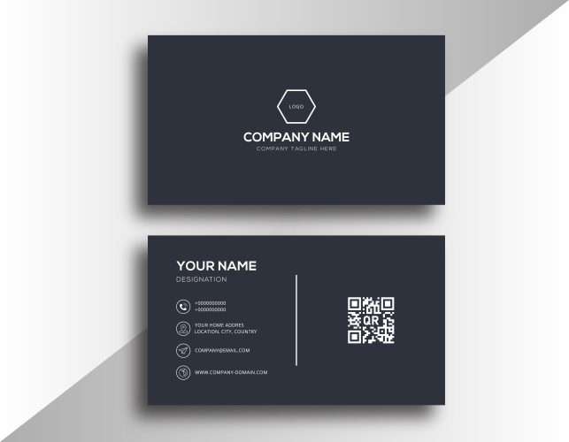
Design. Having a professionally designed card is crucial to making a positive impression with your business card. You should aim for including contact information, and elements like the logo or brand colors of your business. If it makes sense, additional elements like a photo, business description or mission statement can be included, but make sure the design of your card has white space to provide a visual break for the recipient.
Good design for a business card also includes elements you may not necessarily consider. This can include having a good balance of color on the cards, making sure elements and information flow naturally, appear balanced, and are far enough away from the trim lines, and using font sizes that are readable but not too large for the dimensions of the card.
A card can be designed in a vertical layout or different dimensions, but don’t forget to take your intended audience into consideration. A business card larger than standard size may stand out, but it may also not fit where a recipient may store and reference it.
Broadstroke has a design team on staff that understands the importance of the look and layout of a business card. All cards should look professional, but the industry in which you work and your approach to doing business can have an impact on your design – business cards for entertainers and accountants should probably look different from each other.
Usable Space. Take advantage of being able to print a business card double-sided. By printing on both sides of the card you give yourself more space to share key details without making the appearance of the card look too busy. You can have personal contact information on one side of the card and a QR code or company information and details on the other side. This also allows you to bump up the font size a little bit, making it easier to read your contact information.
If you work in a service-based industry your cards can serve the dual purpose of also being appointment cards; put your contact information on one side and use the reverse side for writing in an appointment time as a tangible reminder for your client or customer. Because they’re keeping the card as a reminder of an appointment time, your contact information also remains readily available to them.
Flourishes. Most business cards are 2 inches by 3 ½ inches with square edges. You can clip or round corners to make your cards look different and professionally done, and you can modify anywhere from one to all four corners. You can also add printing elements like foiling or embossing that make a statement by giving the card a distinctive look and feel.
You can also add a spot UV coating to give your card a different finish and help keep the appearance of your card from fading. Keep in mind that a UV coating will affect the finish of the card, so the coating can make it difficult to write on the card if someone wants to make additional notes or you want to use a reverse side for writing in appointment details.
Proofing. The most important part of updating your business card should be your review of it. Always check spelling, grammar, and punctuation. A noticeable spelling error or grammatical mistake looks unprofessional and could wipe out the positive impression you’ve worked to create with the appearance of your card.
Make sure punctuation is appropriate and consistent. If you have more than one address or phone number on your card, you should use the same punctuation and formatting for all of them. Punctual inconsistency may not be as obvious as a spelling or grammatical error, but it doesn’t look professional, either.
Confirm that all the contact information is correct. Make sure you or the person whose information is listed on the card is involved in the proofing process and checking the accuracy of the contact information. If numbers get transposed in a phone number or a name isn’t spelled right in an email address it probably won’t be noticeable to the person who receives the card, but it will prevent them from being able to contact you.
Look at the design and make sure it’s clean and the right fit for your business. Have someone in your company that wasn’t a part of the design process or a trusted customer look at a proof of your card and provide feedback before giving approval to print.
Whether we’re just formatting your business card design for print or helping you with design work, Broadstroke will send you a digital proof of your business card to review before we print it, so you have an opportunity to make sure the final product is correct and the right fit for your business.