

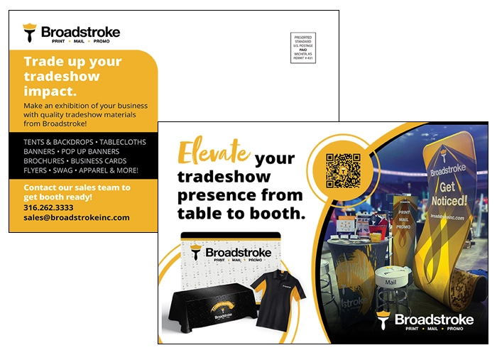
If you are not a graphic designer, when you’re handed a blank canvas to promote your business, it can be easy to want to use as much of that space as possible to provide as much information as possible and draw equal attention to all of it. But it’s better to leave some blank space. Why? It gives people’s eyes (and minds!) a place to rest as they try and process all the information they’re taking in.
It’s a concept that graphic designers learn as white space, whether the space is actually “white” or not. This concept is pretty much what it sounds like; it is space in the artwork that is not used at all. By leaving space unused, you create a design that is both more visually appealing and more likely to leave a lasting impression on the people you are trying to market to.
When most of us think of white space, we think of it primarily as one open spot on the artwork. You can certainly use it this way, as there is no better way to create a visual resting spot, but you need to be strategic about it. Too big of an empty space or a space in an awkward spot can be just as jarring to a viewer as having too much artwork and text in your design.
There are several other ways that you can integrate white space into your design to make it more visually appealing. The first is adding a little more space between items, whether it’s text, graphics, or images. When you leave space between natural breaks in text, like titles, subtitles, and body content, you’re allowing a person to process each piece of information AND building in smaller blocks of white space.
The same goes for not putting visually busy items like text too close to the edge of your artwork. By leaving a margin, you’re essentially creating a white space border around the edges of your design, focusing people’s attention towards the center of your piece. We recommend a minimum of a quarter inch margin for a more visually appealing layout.
Isolating text within a block of color or a design element can also create white space, if the text isn’t too close to the edge of the block or element, and any other items in your design aren’t bumping up against the edge of those blocks or elements. By isolating the text, you’re calling out that it’s important by creating a natural barrier (white space!) around it.
There are several other things you can take into consideration when you’re putting together artwork that aren’t considered white space but will make your design more visually appealing to people and look less cluttered.
A way to create the illusion of white space without leaving a large blank spot in your artwork is to add an image or graphic that isn’t visually busy. This fits with the age-old adage of a ‘picture is worth a thousand words.’ If you can find a picture, graphic, or artwork that isn’t overly busy but helps convey something about your business or a point you’re trying to make, it will help create balance with text and make your piece more eye-catching and memorable to help market your product or service. While you can include a graphic or image that has a lot of detail to it – and there are plenty of times where this is appropriate – keep in mind that doing so is the equivalent of adding a block of text to your piece.
The other easy way to keep your artwork from looking too busy is to not go overboard with things like fonts, colors, callouts, and images or graphics.
Try to limit the different font types you use within the same marketing piece, especially when you’re mixing serif fonts, sans serif fonts, and script fonts. Traditionally serif fonts, like Times New Roman, were used in print, and sans serif fonts like Arial were used digitally. The rules aren’t quite as fixed for most of us, but you’re still better off not using too many different types of fonts or using fonts that are hard to read.
You can have a little more fun with titles or subtitles, but any body copy should be in a font that is easy to read. You can search for different options, but there are reasons why fonts like the sans serif Roboto, Open Sans, and Helvetica/Arial fonts and the serif Georgia, Garamond, and Times New Roman fonts are ubiquitous – they’re easy to read.
Script fonts are available too, and it can be easy to go overboard with these. Keep in mind that script fonts can be difficult to skim for valuable information. They are better used for callouts or a few words of text. When used this way they can not only be used to convey and draw attention to information, but they also provide an additional design element to your piece.
Using too many colors, callouts, images, or art elements on your piece can also make it appear too busy. Try and limit the number of colors you use. If a neutral color like black, white, or gray is part of your design you have a little more flexibility to incorporate an additional color or two, but you should do so in moderation.
Callouts should be limited and reflective of the size of your marketing piece. If you have a small piece like a postcard, it’s best to keep it to a single callout on either side. If you have something larger, like a poster, you have room to include more. Just remember that every additional callout you include dilutes their individual impact.
If you have a very visual product or service, it can be easy to use lots of photos on your marketing piece. This is helpful to a point, but it can also begin to look cluttered if it isn’t done thoughtfully. Grouping photos or graphics together (kind of like a film strip) or spacing them widely apart can help. So can using pictures with similar color schemes or subjects (all flowers, all food, etc.)
If you’re planning to do multiple marketing or sales pieces to attract customers, it’s a good idea to create brand standards for your business. Brand standards go beyond just your logo. They standardize things like a color palette, font types, taglines, and other key design elements. They will not only help keep individual pieces looking visually appealing but will help you create consistency across your different pieces and build recognition for your business.